
A new tool to compare changes in spreadsheets.
I led the design of Workshare’s first Excel comparison product and devised a source-formatting approach that was later granted a US patent.
The project in 30 seconds
One cell could change in several ways at once, while the workbook’s own styling competed with comparison highlights. I led the design direction for a single review experience that made those differences understandable without losing the spreadsheet’s context.
- Company
- Workshare
- My role
- Senior Product Designer
- Team
- Two supporting designers and three dedicated engineers
- Timeline
- 2017 to 2018
- My contribution
- Discovery, product direction, interaction design, testing and patent disclosure
- The challenge
- Reveal multiple kinds of change without turning a complex workbook into more noise
- Outcome
- Compare for Excel shipped in Workshare Professional 10. The source-formatting approach was later granted US Patent No. 11,080,462.
A gap in the comparison suite
Workshare’s customers already used its products to review changes in Word and PDF files. Spreadsheets were another important part of their work, but Workshare had not yet built its own Excel comparison experience. Some customers used Microsoft Spreadsheet Compare through the suite. Others used competing tools or worked through differences manually. In our customer research, no product on the market fully met their needs. We saw the chance to extend Workshare’s core strength into a file type where reviewing changes could be especially difficult.
I helped lead the discovery for the new product. We spoke with people who used spreadsheets in legal, finance, operations and public-sector work, including customers and colleagues who understood those workflows first-hand. They described large workbooks with many sheets, formulas, conditional formatting and several people contributing changes. To check a new version, some placed files side by side; others used VLOOKUP, custom formulas or a separate comparison tool. When the result was unclear, they asked a colleague what had changed and why.
Their needs were not identical. A financial analyst might need to know whether a formula had been altered. A reviewer in a law firm might need a clean report to share. Others might care about small changes to comments or notes. The common need was to move from where something changed to what that change meant, without losing their place in the spreadsheet.
Understanding what a cell can contain
The first major design task was learning how much could change inside a spreadsheet. A cell could have a new value or formula, but also a different number format, font, fill, border or merge state. Rows and columns could be inserted or deleted, shifting other cells without anyone editing them directly. The same cell could carry several changes at once.
I dug into Excel’s structure before settling on the interaction model. We needed to distinguish a direct edit from an indirect change caused elsewhere, represent multiple changes to one cell, and help people filter out noise. A flat list of differences would make a complex workbook harder to review. Hiding all the detail would leave users unable to trust what they were seeing.
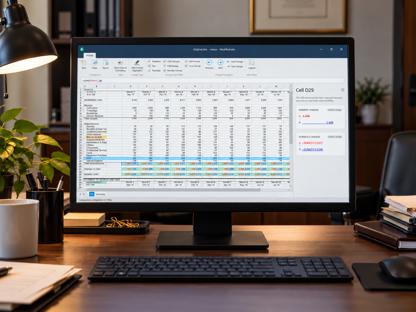
I explored several comparison concepts and tested them through sketches and interactive prototypes. The model that emerged kept the spreadsheet visible as a single compared view. Colour highlighted changed cells; selecting one opened its individual changes beside the sheet. Filters let people focus on values, text, formulas and formatting. Navigation moved through changed cells, while export produced an Excel file that could be saved and shared.
The order in which we presented changes was refined through testing. We had proposed a hierarchy based on what we expected people to notice first. Watching them review real examples showed that structural changes such as merging, inserting or deleting cells could be more important than copy edits. We also placed cell formatting ahead of text formatting. That hierarchy helped the detail panel answer the user’s immediate question before asking them to work through lesser changes.
Separating change highlights from the workbook’s own formatting
People often use colour and style to communicate meaning in spreadsheets. A red cell might indicate a financial risk and a green column might mark an approved figure. Comparison software also uses colour to show edits. When both appear at once, the original formatting can look like a change being highlighted, and a real change can disappear into the formatting added by the user.
I developed a method that let users hide the spreadsheet’s source formatting while keeping the comparison highlights visible. They could then turn the original formatting back on when they needed its context. The default view made changes easier to scan; the alternate view helped explain what those changes meant. It was a small control with a substantial effect on readability.
I documented the approach in a patent disclosure. Workshare later filed it, and Robin Glover and I are named as co-inventors on the US patent granted for the method.
Building a new kind of Workshare desktop app
This was my first time designing a Microsoft desktop application. I had to learn the conventions of the Windows ribbon and work out how to use them without making a new product feel foreign to Workshare customers. The ribbon held comparison actions such as changing filters, moving between changes and exporting, while the spreadsheet remained the centre of attention.
I led the design direction. Two designers supported specific design and testing tasks, and I worked closely with the engineers building the interface. We sat beside each other for months, discussing how the comparison model would behave as the technical detail came into focus.
At the same time, we created a component library for this product so its controls and states remained consistent as the interface grew.
From prototype to pilot
Prototype testing with customers gave us clear insight into improvements we could make before development was complete. Alongside the change hierarchy, feedback prompted clearer explanations of colour, a formula bar, better wording and export options. These were not just cosmetic requests. Each made it easier to understand a comparison, check the underlying spreadsheet logic or pass the result to someone else.
Compare for Excel reached a limited pilot and users responded very positively. Workshare subsequently included Compare for Excel in its Professional 10 suite, released to customers in December 2018.
The result was a new product in the suite and a more considered way to review spreadsheet changes. The work I value most was making Excel’s complexity visible only when it helped, showing people the right change first, letting them inspect the detail, and giving them control over the visual context needed to understand it.