
Data visualisation across sports.
iSport Genius is a rich engine for finding patterns in sports data, but the experience made those insights hard to grasp. I led a redesign of the platform that gave the information a clearer hierarchy and a visual language that could work across sports and within sports betting apps.
The project in 30 seconds
The platform had the data, but crowded pages made it difficult to find a sport, league, match or team and understand the statistics behind it. I led a complete redesign built around predictable navigation, progressive detail and consistent data visualisation.
- Company
- iSport Genius
- My role
- User Experience Designer
- Team
- CEO, product and engineering
- Timeline
- 2016 to 2017
- My contribution
- Research, information architecture, interaction design, visual design and delivery review
- The challenge
- Make dense sports data easier to read, compare and interpret.
- Outcome
- The complete redesign shipped as an insights product integrated into sports betting apps, including Ladbrokes.
The data was there but the meaning was hard to find
Genius Tech Group had built a substantial sports-data platform called iSport Genius. It could analyse historical results to surface how teams performed in different conditions, against an opponent, at a venue or around a particular betting market. The commercial model was to make those insights available inside sports betting apps as a feature that helped their customers research a game.
The challenge I saw when I joined was the gap between the richness of the raw data and how difficult it was for someone to make sense of it. Data was being placed onto pages without enough structure to show where to start or which figures mattered. A person could see a lot, yet still struggle to understand what it meant about a team. The existing information architecture also made it hard to move between sports, leagues, matches and deeper statistics.
I was not a regular bettor, so I could not assume the product’s language or logic would be obvious. I spent time learning the domain from the team and from people who placed bets regularly or occasionally. Early interviews and usability testing identified problems with navigation, match previews, search and discovering relevant data.
Give the user a path through the product
The first design move was to make the structure predictable. A user needed to choose a sport and league, find a current or upcoming match, and know where they were as they moved into a team or match view. Each sport, however, brought its own terminology, competitions, schedules and types of statistics.
I developed a navigation approach that applied consistent rules across sports while leaving room for the differences between them. Sport and league selection sat at the top of the journey and match selection remained close to the content it controlled. Search and shortcuts to scores, teams and other areas helped people reach what they already had in mind. The aim was to make useful content findable through the interface rather than requiring someone to know where a page lived.
The most difficult challenge was deciding how to present all of the raw data in a clean, structured way. The platform could generate far more data than any one page could cleanly present. I worked on a hierarchy that gave people a short, useful overview first and let them move into related detail when a question called for it. This let users choose what they wanted to dig into first without overwhelming them from the start.
Turn a team insight into something a person can read
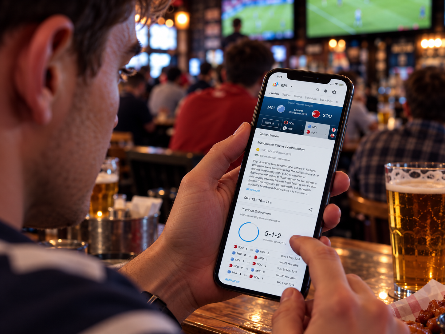
The match preview became a useful example of that thinking. Early concepts tried to solve too many needs in one large card. Match lists, team statistics and other details competed for the same space. It made the card comprehensive, but not especially helpful.
I separated this information. A person could identify the match, see the headline team information, then explore the more detailed statistics in their own sections. The cards became simpler, and the surrounding page did more of the organising. Visualisation and spacing helped people compare information.
I spent time with the team on over/under statistics and how betting-market information should appear. We needed the presentation to be understandable in its own right and consistent from one sport to another. The exact rules differed by sport, but a user should not have to relearn how to read the product every time they changed leagues. That consistency became part of the design language for the wider platform.
Take the model into a working product
The work covered responsive views, including the menu, search, filters, match previews and deeper team pages. I developed concepts and prototypes, tested them with users and refined them as we worked through the information and interaction details. Design breakdowns were shared with engineers and every week we ran rounds of feedback on implementations. I stayed close to delivery, reviewing what was built with the engineers daily and working through behaviour tweaks and optimisations.
A clearer product for punters
The complete redesign shipped. iSport Genius remained an insights tool that sports betting operators could incorporate into their existing apps. Ladbrokes’ InfoHub was the first platform to integrate it. Other operator partnerships followed as the platform evolved.
The redesign made the platform substantially clearer. A dense statistical product now had a much more predictable structure, a more readable hierarchy and visual patterns that worked across sports and betting markets. Users could start with a useful summary, then move into the detail behind an insight without relearning the interface for each sport.