
A native shopping experience for customers.
Leading Catch’s native Android rebuild, from product definition and hands-on design to creating the systems and ways of working that shaped how projects were delivered moving forward.
The project in 30 seconds
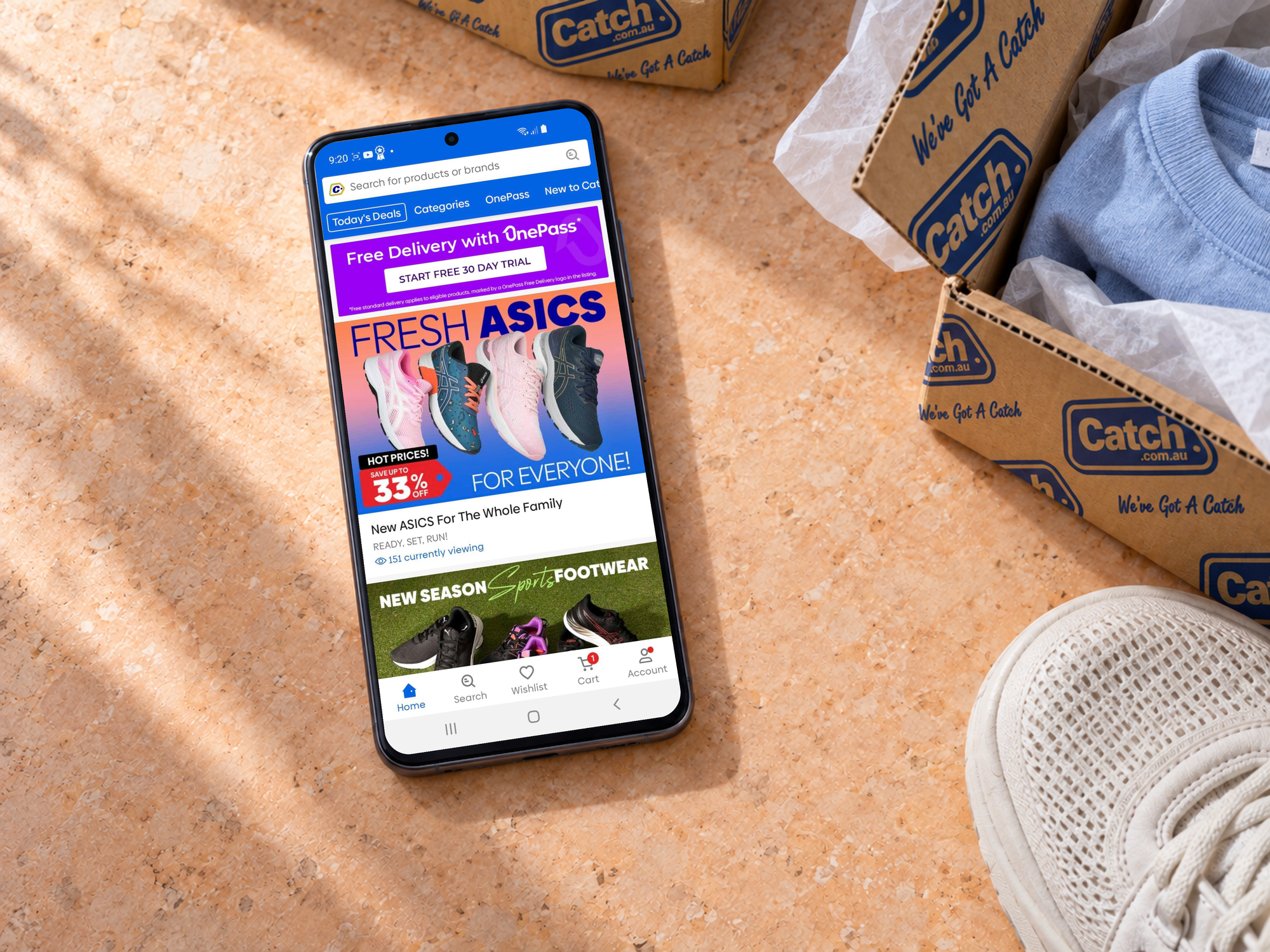
Android represented around 55% of Catch’s mobile audience, but those customers were getting a poor experience. I led the design direction for a genuinely native rebuild of the Catch Android app, and created new ways of working that allowed the team to deliver the app within 12 months.
- Company
- Catch
- My role
- UX Lead
- Team
- Product Manager, four designers and approximately seven engineers
- Timeline
- 12 months
- My contribution
- Product definition, design direction, interaction design, research and design system
- The challenge
- Build a native Android experience within Catch’s marketplace and promotions infrastructure
- Outcome
- The app launched at 4.7 stars. Android performance later reached parity with iOS, while the design practices established on the project scaled across Catch.
Android customers were getting the worst version of Catch
Catch had invested heavily in its iOS experience, while Android had effectively been left behind.
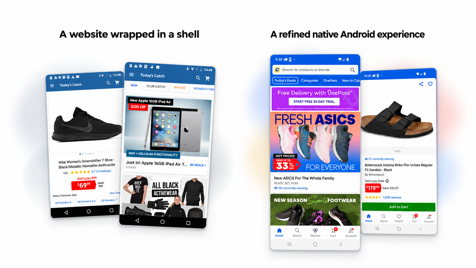
The app was little more than Catch’s responsive website inside an Android shell. It technically worked, but it didn’t behave like an Android product and the experience showed it. Engagement and conversion were weaker, ratings were poor, and customer feedback reflected an experience that felt inconsistent and unpolished.
That mattered because our own traffic data showed Android represented around 55% of our mobile audience.
We didn’t want to solve that by simply rebuilding the iPhone app on Android. The opportunity was to create an experience that still felt unmistakably Catch, but behaved the way an Android customer expected it to.
Defining what we were actually building
The Product Manager and I spent considerable time defining the first release before the team jumped into individual features.
The first version had to support the complete shopping funnel: home, search, filtering, product results, product detail, cart and checkout. Features such as personalisation, recommendations and more sophisticated discovery would come later.
I ran a series of working sessions with the team using whiteboards, printed screens and rough prototypes. They were deliberately low-tech. The objective wasn’t polished design, it was to establish a shared picture of how the whole experience worked before designers and engineers started solving individual pieces.
That became our north star for the project.
Native Android, not iOS with a different skin
One of the things I pushed hardest for was treating Android as its own platform. We studied Material Design, compared popular Android and iOS e-commerce products and looked at how Android customers navigated and shopped.
That changed practical decisions around system back behaviour, navigation, multitasking, pickers and controls. Native patterns also let us work with Android’s accessibility behaviours while designing for a much less predictable range of screens and devices.
Our principle was simple: learn from iOS, but respect that we were building an Android app for Android users.
Designing around the messy reality of a marketplace
We weren’t starting with a clean e-commerce platform.
Catch sold its own inventory alongside marketplace products from thousands of sellers. Product metadata had been entered over many years without consistent standards. A size such as Small, for example, could exist as S, SM, Small and other variations.
That complexity was most obvious when applying filters.
The best design solution would have required fixing the underlying catalogue. That wasn’t realistic within the scope of the Android rebuild, so we needed an interface capable of making imperfect data usable.
We first needed to better understand how customers were already using our filters. So we tested iOS filtering heavily.
The testing exposed some significant problems. Customers confused sorting with filtering, struggled to navigate the volume of options and weren’t always sure whether their selections had been applied.
We used these insights to design early prototypes and tested them against the existing experience.
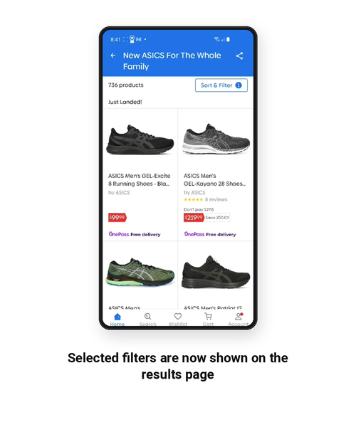
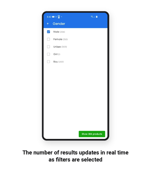
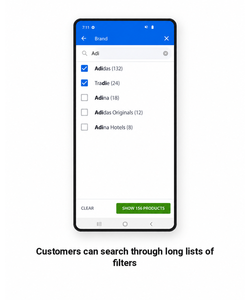
We introduced progressive disclosure for large and nested sets of filters, search within filters, live result counts and a clear summary of the selections customers had made.
Subsequent testing led us to refine these further. Filtering and sorting were brought into a clearer model, product counts became much more visible and we refined how customers moved through nested filters.
By the time we concluded testing, every participant could successfully interact with the filtering experience and the nested accordion pattern presented no usability problems.
The rapid prototyping and iterative approach to designing the experience was a key contributor to how we were able to deliver a great experience in such a short time. We didn’t need to test high-fidelity prototypes right away. We could have an idea, spend 30 minutes pulling together a prototype and begin testing. Often, with unmoderated user testing, we would have results within a few hours.
Building the product and the design practice at the same time
Catch’s previous design process was deliberately loose. Small teams sat close together, designed something and shipped it.
That worked when the work was small. It didn’t scale to rebuilding an entire app.
I introduced clearer definitions of ready and done, regular design reviews, structured handover and design sign-off. I also created the Android UI system so that four designers could contribute at different stages without slowly producing four different versions of Catch.
This wasn’t process for process’s sake. Catch already suffered from inconsistencies that made parts of the experience feel disconnected and, to some customers, ‘spammy’.
The system gave designers and engineers enough structure to move quickly without gradually losing the product we had originally set out to build.
The impact went beyond Android
The new app launched at 4.7 stars, up from around 3.5.
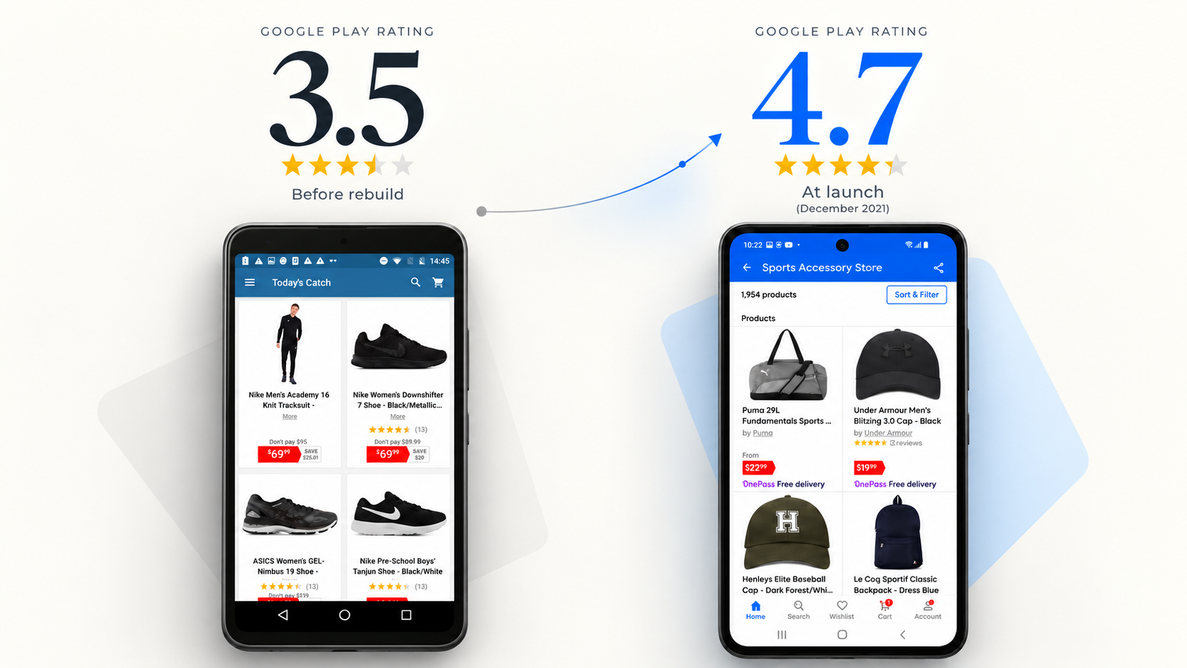
We couldn’t judge the commercial result immediately. Adoption of the new Android app was gradual, and some customers continued using older versions for some time. But over the following months, Android GTV (Gross Transactional Value) and product performance reached parity with iOS and in some areas surpassed it.
More interestingly, Android stopped being the product that followed everything else.
The filtering model influenced subsequent work on Catch’s other platforms. The more consistent home experience was adopted in iOS. Product-detail improvements including larger imagery, horizontal image browsing and persistent purchase actions also began finding their way into Catch’s broader experience.
The ways of working spread too. I scaled the same product design practices across the UX team and they became the standard for how design worked across the business.
Alongside a wider shift in Catch’s design maturity, my role became broader than the Android project. I became increasingly involved in technology leadership conversations alongside the CTO, with design participating earlier and more consistently in product and technology decisions.
The most important result was broader than the app itself. The project demonstrated what Catch could produce when design helped define the product from the start.