
Streamlining online account activation.
AustralianSuper members could have an account long before they had online access. I led the redesign of registration so they could activate that access with clearer guidance, better support for stricter password requirements and a more streamlined verification journey.
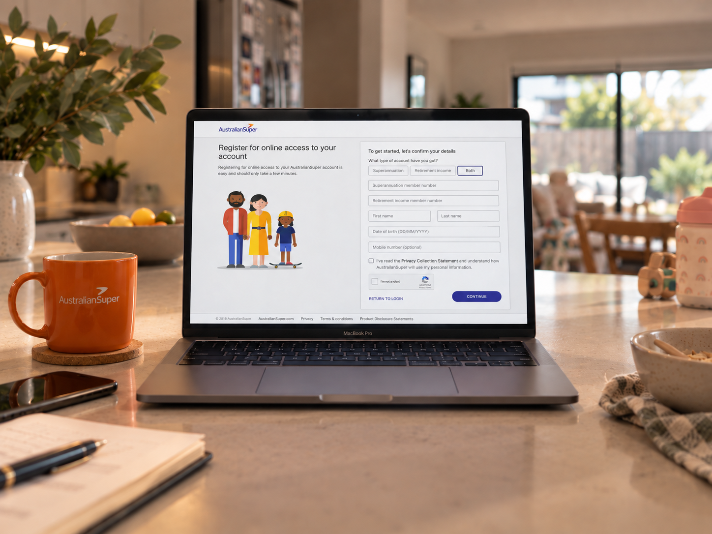
The project in 30 seconds
Becoming an AustralianSuper member did not automatically give someone online access to their account. Members need to register for online access after their member account is created. This process was clunky and contributed to a significant number of support calls from members asking for help. I redesigned the experience from discovery through launch, balancing identity, security and architecture constraints with clearer guidance and recovery paths.
- Company
- AustralianSuper
- My role
- Senior Experience Designer
- Team
- Product Owner, security, architecture, research and delivery
- Timeline
- November 2018 to November 2019, with a funding pause
- My contribution
- Discovery, journey design, prototyping, research direction and delivery support
- The challenge
- Make a secure activation journey easier to understand, reduce support call volumes and increase the proportion of accounts activated online.
- Outcome
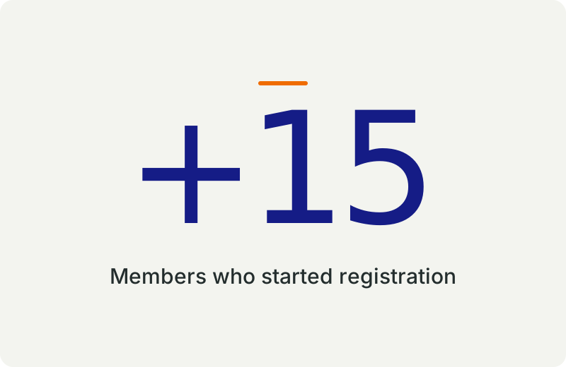
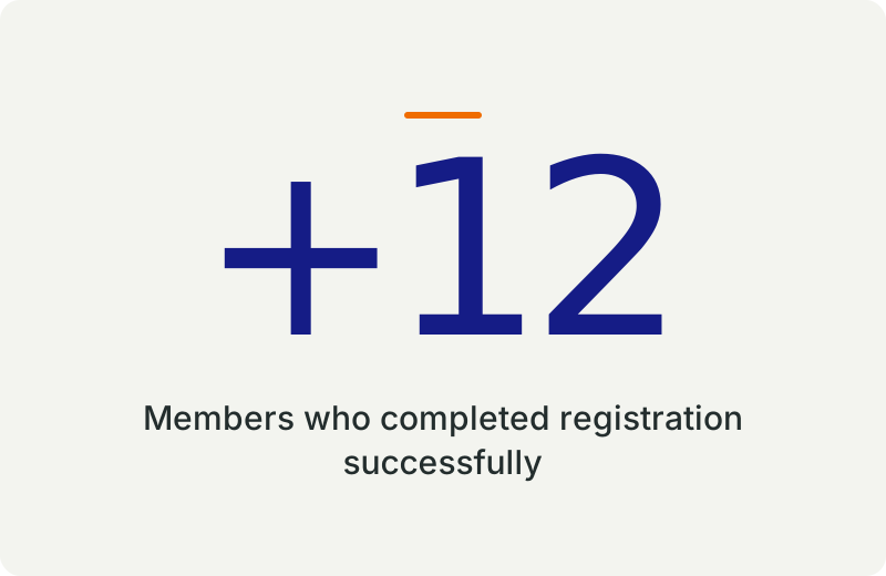
- After launch, 15% more members started online registration and 12% more completed it, while fewer members needed to call for help.
You could be a member of the Fund and still not have online access
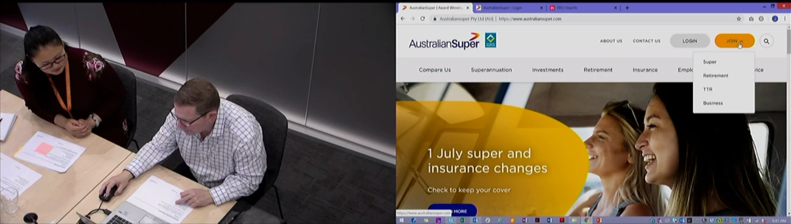
In one recorded support journey, a member called AustralianSuper for help setting up online access to his account. His verification email had gone to spam, with the link disabled. Support helped him, but he also struggled to create a password that met AustralianSuper’s password rules. After about 15 minutes on the phone, he gave up and decided to leave the fund. It was one failed journey, but it made the consequences of registration friction hard to ignore.
AustralianSuper had more than 2.2 million members. Many were enrolled by their employer, so becoming a member and gaining online access were separate tasks. Our brief focused on that gap. The experience we eventually released served all existing members activating online access.
The old process asked members to choose an account type, confirm personal details, create a username and answer a security question. It then sent a link that expired after 24 hours. Members had to find the email, open the link and continue elsewhere to finish setting a password. The registration route itself was also difficult to find.
My responsibility was the experience across that whole journey. I worked with the Product Owner, security, architecture and delivery partners to make it easier to complete, balancing the security requirements with ease of use.
From a dense form to a guided start
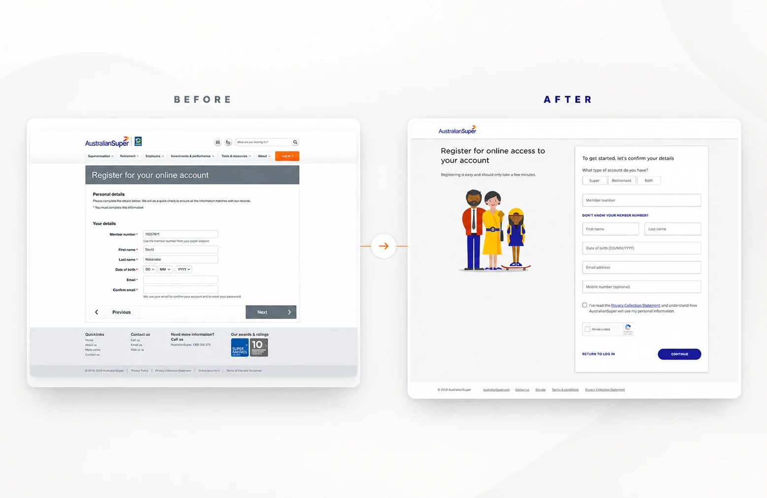
The old registration page placed identity details inside a crowded site template. The redesign brought account type and member details together, with clearer guidance and a simpler path forward.
Make a fixed password rule easier to meet
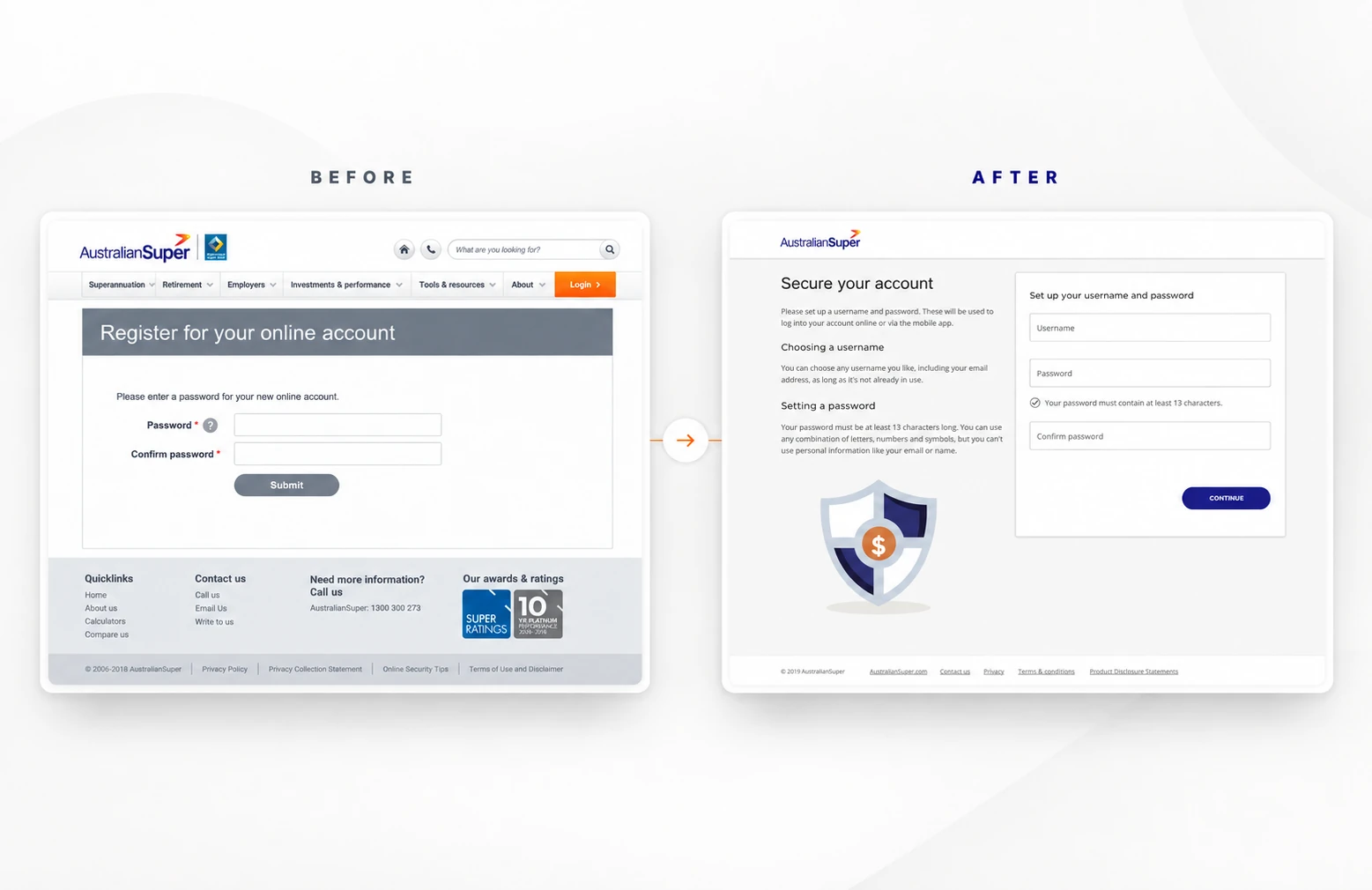
The 13-character requirement remained. The redesigned step explained it before submission and gave members specific feedback as they created and confirmed their password.
Keep verification inside the journey
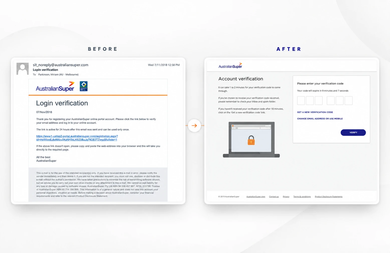
The old email link moved members away from registration and could end up in junk folders. The new flow used a short-lived email code, with clearer expiry, resend and recovery paths.
From a dense form to a guided start
The old registration page placed identity details inside a crowded site template. The redesign brought account type and member details together, with clearer guidance and a simpler path forward.
Make a fixed password rule easier to meet
The 13-character requirement remained. The redesigned step explained it before submission and gave members specific feedback as they created and confirmed their password.
Keep verification inside the journey
The old email link moved members away from registration and could fail in junk folders. The new flow used a short-lived email code, with clearer expiry, resend and recovery paths.
The 13-character password rule
The hardest negotiation was the Fund’s new password policy. Security required a minimum of 13 characters and would not relax it. Members still had to be able to create a valid password without repeated failed submissions or guessing which rule they had broken.
I pushed for feedback at the point where people needed it. The redesigned password step explained the requirement in plain language and showed whether a password met it as the member typed. It also handled disallowed passwords and mismatched confirmation with specific guidance. The interface made the rule visible before submission, when someone could still act on it.
This was a recurring conversation with security. I challenged requirements when they created unnecessary friction and argued for a clearer way to meet the same protection goal. Sometimes the team accepted my reasoning and sometimes the security requirement remained firm. The 13-character minimum was one of those fixed constraints. How members understood and satisfied it was a design decision we could improve.
Security questions were another limit. The workshop identified them as confusing, and some members later questioned how secure standard questions really were. Replacing them would have required substantial backend work and was deferred alongside broader identity changes. We kept the step in the released journey and improved its guidance and error handling.
Keeping verification in the same journey
The existing activation link was a fragile handoff. Emails could land in junk folders or have their links disabled, and following a link moved members out of the registration flow. We redesigned that step around two-factor authentication, a short-lived code sent by email and entered on the registration page.
Earlier concepts explored both SMS and email. The released experience used email only because of concerns about mobile security. That decision still required careful handling of expiry, resend attempts, incorrect codes and locked accounts. It also required the right support path when a member could not complete verification alone.
We reorganised the rest of the journey around this verification step. Account type and identity details sat together, username and password were handled together, security questions remained separate and verification came last.
Research changed the language and exposed a wider problem
I ran a cross-functional discovery workshop in November 2018, then developed and refined the registration concepts with the team. The work paused for several months until the project funding was approved. In July 2019, we tested the existing flow and an early prototype with five participants.
The study showed how much work remained. Four of the five struggled to find registration on their first attempt. Four found the 13-character password difficult. All five were unfamiliar with some of the terminology we used at the time to help make passwords more approachable. We dropped the term “passphrase” and strengthened the instructions for creating a password. Participants also raised concerns about standard security questions, wanted clearer help throughout the process, and wanted to know why the Fund might ask for a mobile number.
The testing also reinforced that registration itself needed to be easier to find.
Within the registration flow, the testing helped us make the security language more familiar and the guidance more useful. It also gave the team a clearer view of the barriers members faced when trying to get online.
What changed after launch
The redesigned registration experience launched in November 2019. I stayed involved through delivery and launch, working through the practical constraints with the Product Owner and security team. After launch, we saw a 15% increase in members who started the registration process and a 12% increase in members who completed their online registration.
The achievement was a more understandable and resilient path into online access. We gave members clearer instructions, earlier feedback, a direct verification step and practical recovery paths when details did not match or a code failed. The 13-character password rule remained, but members were better supported and more of them both began and completed the journey.